Description
Clients choose colour on a screen. You have to deliver it in fabric, flower, glass, metal and timber, under lighting you did not choose, in a room that already has its own carpet and wall colour. That gap between the swatch and the room is where most disappointment lives, and no amount of mood-boarding closes it.
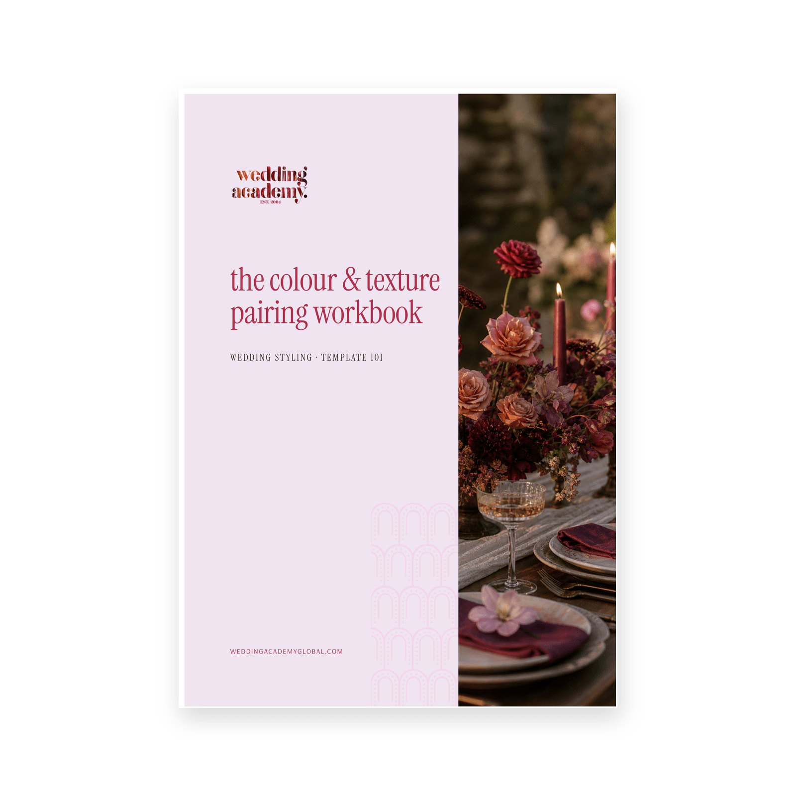
The Colour and Texture Pairing Workbook teaches you to think in pairs instead of colours: a hue and the material carrying it. Then it walks you through building three complete schemes for one wedding so your client chooses rather than approves.
What is inside
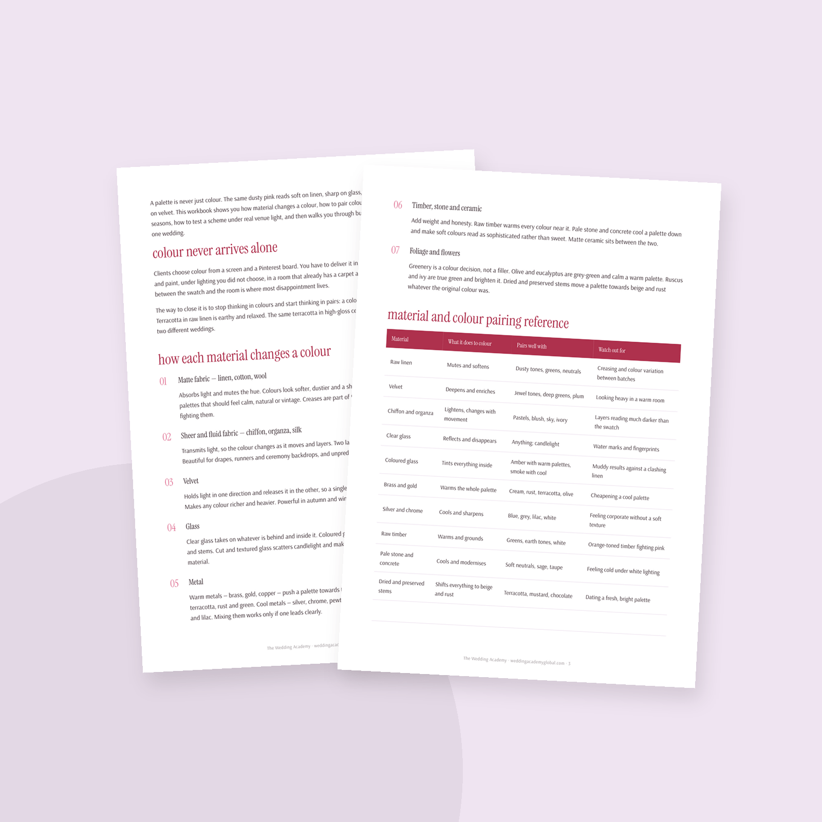
- How seven material families change a colour — matte fabric, sheers, velvet, glass, metal, timber and stone, foliage
- A material and colour pairing reference table with what each pairs with and what to watch for
- Seasonal pairings for spring, summer, autumn and winter, with lead texture, metal and foliage for each
- How light source shifts hue, and how to run a swatch test in the actual room at the actual hour
- A swatch test kit list so nothing is missing from the meeting
- Composition rules that hold up: lead colour, three textures, one leading metal, the rule of three repeats
- Three full scheme worksheets — the safe scheme, the elevated scheme and the bold scheme
- A side-by-side comparison sheet to run the client meeting from
Who it is for
Wedding stylists and planners who present design to clients, florists expanding into styling, and anyone whose palettes look right on the board and flat in the room.
After you use it, you can explain why a scheme works, you catch the colours that vanish under dinner light before the day, and you walk into a design meeting with three costed options instead of one hopeful one.
What’s inside
- How seven materials change a colour
- Material and colour pairing reference table
- Seasonal colour and texture starters
- Testing a palette under venue light
- Swatch test kit list
- Composition rules for colour and texture
- Three scheme worksheets to fill in
- Client meeting comparison sheet