Your moodboard might be misleading every vendor you hire. Not because your taste is off — because the board is saying things you never meant it to say.
You see a cohesive vision. The florist sees forty images and wonders which arch you actually want. The hire company sees a chair you loved in passing and quotes for two hundred of them. The photographer sees a heavily filtered gallery and assumes you want that grade in a venue that physically can’t produce that light. Everyone quotes in good faith — for a slightly different wedding.
Here are the wedding moodboard mistakes that cause the most confusion between stylists and suppliers — and the simple fixes that turn a pretty collage into a working design document.
Why wedding moodboard mistakes cost you more than you think
A moodboard is a communication tool, not a scrapbook. The moment it leaves your hands, it gets read by people with very specific questions: How many stems? What height? Which linen? What colour, exactly? If the board can’t answer those, each vendor fills the gaps with their own assumptions.
That’s where the trouble starts. Quotes come back that can’t be compared. The couple falls in love with a version of the design that nobody has actually priced. And on the day, florals, furniture and lighting arrive looking slightly out of step — because every supplier read the same pictures differently.
Clear visual briefing is a core stylist skill, and it’s one we put real time into in the Certificate in Wedding Styling. The good news? Most moodboard mistakes are habits, and habits are fixable.
The 10 most common wedding moodboard mistakes
1. Too many images and no edit
Sixty pins isn’t a vision — it’s a search history. When everything is on the board, nothing is a priority, and vendors have to guess which images matter. Edit hard. If an image doesn’t earn its place by showing something specific, it goes.
2. Mixing aesthetics that clash
A sleek minimalist tablescape next to a wild, rambling meadow install next to a heavy baroque candelabra. Each one is gorgeous. Together, they tell your florist and your hire company three different stories. Pick a design direction and make every image support it.
3. Pinterest images that are impossible for the season, budget or venue
That peony-heavy arbour shot in someone else’s spring won’t magically happen in your couple’s autumn. That ceiling install was built over days by a large team. That glasshouse light doesn’t exist in a ballroom with no windows. Pinning the impossible sets an expectation every vendor has to walk back — usually after the couple is attached.
4. No colour palette with actual swatches
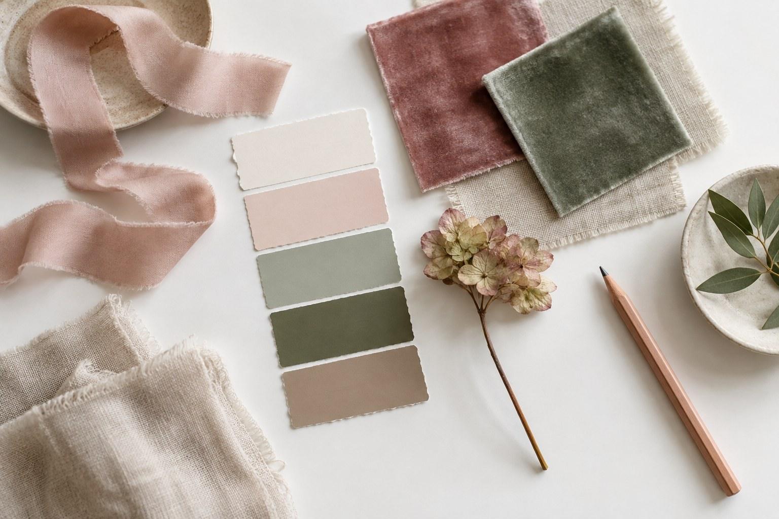
“Dusty pink” means a dozen different things to a dozen different people. Without physical or precisely matched swatches, your florist, your linen supplier and your stationer will all land on their own version of dusty pink — and they won’t match on the day.
5. No notes on what each image is for
You pinned the image for the chair. The florist thinks it’s for the flowers. The caterer thinks it’s for the grazing board in the background. An un-annotated image invites every vendor to read it through their own lens. One short caption — “the chair only” — fixes it.
6. Ignoring the venue’s real architecture and light
Inspiration images live in perfect rooms. Your wedding doesn’t. Ceiling height, wall colour, carpet, fixed fittings and the actual light at the time of the reception all change how a design reads. A board built without the venue in mind is styling a room that doesn’t exist.
7. No scale or quantities
A close-up of one gorgeous centrepiece tells a florist nothing about how many tables, how tall, or whether every table gets the same treatment. Vendors quote on quantity and scale — if your board doesn’t say it, the quote is a guess.
8. Sharing a moodboard but no written design brief
Pictures carry feeling; words carry facts. A board on its own can’t tell a hire company the guest count, the bump-in window or that the couple hates gold. A short written brief alongside the visuals removes most of the back-and-forth emails before they happen.
9. Changing the board after vendors have quoted
You swapped the arbour, added a hanging install and changed the linen — but the florist and the hire company quoted on last month’s board. Now nobody’s numbers are accurate, and someone is going to find out the hard way.
10. Treating heavily edited photos as real colour
Many styled shoot images are graded — warmed, desaturated, faded, pushed toward a particular tone. Ask a florist to match those colours and they’re matching a filter, not a flower. Your photographer may also read the board as a request for that editing style. Be explicit about which you mean.
Moodboard mistakes vs what the vendor actually hears
Here’s the translation guide. Left column: what you did. Middle column: how a florist, caterer, hire company or photographer is likely to read it. Right column: the fix.
| Mistake | What the vendor hears | Fix |
|---|---|---|
| Too many images, no edit | “They want everything — I’ll quote for the most expensive version.” | Edit to the images that each show one clear, specific element |
| Clashing aesthetics | “I’m not sure what the style is, so I’ll lean on my own taste.” | Choose one design direction; cut anything that fights it |
| Impossible inspiration | “The couple expects this exact result in a different season and space.” | Check season, venue and budget before pinning; label anything aspirational |
| No real swatches | “I’ll match the colour on my screen.” | Physical or precisely matched swatches shared with every vendor |
| No annotations | “This must be about my part of the image.” | Caption every image with what it’s for — and what to ignore |
| Venue ignored | “I’ll design for a generic room.” | Put real venue photos beside the inspiration |
| No scale or quantities | “I’ll guess numbers and sizes.” | Add table counts, heights, lengths and placements |
| No written brief | “I’ll email ten questions — or just assume.” | A one-to-two page brief travels with the board |
| Changes after quoting | “My quote is wrong and nobody told me.” | Version numbers, dated change notes and sign-off |
| Edited photos treated as real | “They want that filtered colour in real life.” | State whether the image shows colour, mood or editing style |
How to fix your wedding moodboard so vendors can quote accurately
Make one board per element
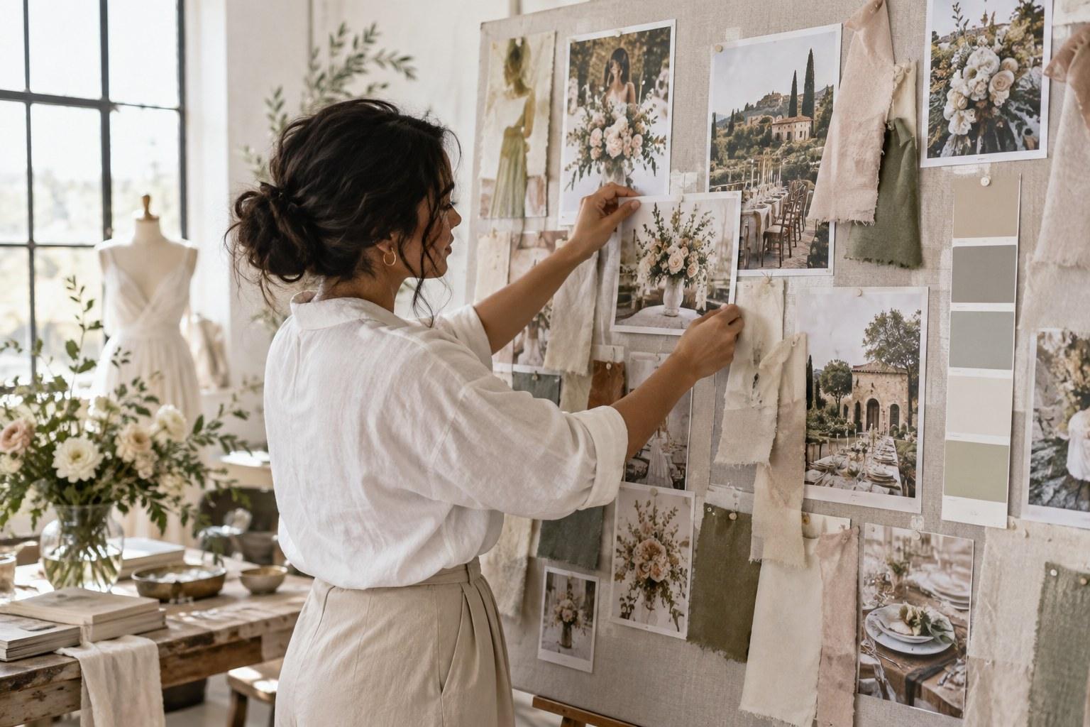
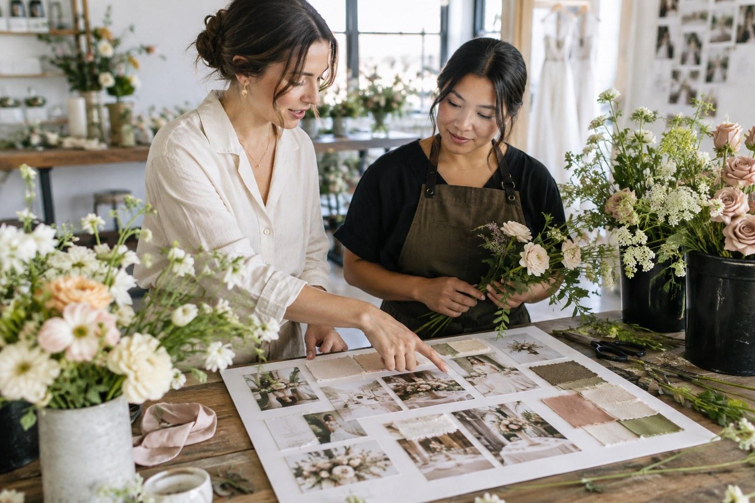
Keep a single overview board for the couple — the feeling, the palette, the story. Then break it into working boards by element: ceremony, florals, tablescape, furniture and hire, lighting, stationery. Each vendor gets the board that’s relevant to them, plus the overview for context. Fewer images per board, far less confusion.
Build a palette with real swatches
Collect physical samples — ribbon, fabric, paint chips, a sample stem where possible — and photograph them together in neutral daylight. Where you can, reference a recognised colour system so a supplier can match it rather than eyeball it. Send the same swatch set to everyone.
Annotate everything
Short, blunt notes beat clever ones. “Chair style only.” “This colour of blush, not the greenery.” “Mood of the lighting — warm, low, candlelit.” “Ignore the arch.”
Write a design brief to sit alongside the board
Keep it short and practical: date, venue, guest count, table layout, bump-in and bump-out times, the design direction in a sentence or two, must-haves, hard no’s, and who signs off. The board shows the look; the brief gives the facts a quote depends on.
Put venue photos next to the inspiration
Take your own photos at the venue — ideally at the time of day the ceremony and reception will actually happen — and place them beside the inspiration. Now everyone can see the ceiling height, the existing fittings and what the design is working with (and against).
Use version control and get sign-off
Name boards with a version and date. When something changes, log what changed and tell the affected vendors directly — don’t rely on them noticing an edit to a shared link. Once the couple approves a version in writing, that’s the version vendors quote and deliver against. Any change after that is a formal variation, not a casual tweak.
Add a “not this” board
Sometimes the fastest way to explain a style is to show what it isn’t. Too rustic, too glam, the wrong green, chairs the couple dislikes. A small “not this” board heads off a surprising number of misunderstandings — and it’s especially useful for florists, who are constantly balancing their own style with yours.
If you work closely with florists, it helps enormously to understand how they think about stems, seasonality and mechanics. The Certificate in Floral Design is a great companion to styling for exactly that reason.
A quick wedding moodboard checklist before you hit send
- Is every image there for a reason — and is that reason written on it?
- Does every image belong to the same design direction?
- Is everything achievable in this season, this venue and this budget?
- Have you included real swatches, not just screenshots?
- Are there venue photos beside the inspiration?
- Have you added quantities, sizes and placements?
- Is there a written brief attached?
- Is the board versioned, dated and signed off by the couple?
Tick all of those and your board stops being a mood and starts being a plan — one that planners can coordinate against, too. If you also handle logistics, the Certificate in Wedding Planning covers the supplier management side in depth.
Want to learn how professional stylists build design concepts, palettes and vendor briefs from scratch? That’s exactly what the Certificate in Wedding Styling is built for. ✨
Wedding moodboard FAQs
How many images should a wedding moodboard have?
There’s no magic number — what matters is that every image has a clear job. Keep the overview board tight enough that the direction is obvious at a glance, and move detail into separate element boards for each vendor.
Should I send my wedding moodboard to every vendor?
Send every vendor the overview board for context, plus the specific board and written brief for their element. Irrelevant material is exactly what causes confusion.
What is the difference between a moodboard and a design brief?
A moodboard shows the look and feel visually. A design brief puts the facts in writing — date, venue, guest numbers, layout, timings, must-haves, hard no’s and who approves changes. Vendors need both to quote accurately.
Can I use Pinterest images on a wedding moodboard?
Yes, as inspiration — but check each one is realistic for the season, venue and budget, annotate what it’s for, and be clear whether the colours are real or the result of photo editing. Label anything purely aspirational so no one quotes for it by accident.
What should I do if the couple wants to change the moodboard after vendors have quoted?
Create a new dated version, list exactly what changed, and send it directly to the affected vendors so they can re-quote. Get the couple’s written sign-off on the new version before anyone orders or builds against it.
Ready to brief vendors like a pro and design weddings that look exactly the way you pictured them? Your next step starts here.