Your bride sends you a photo of her bridesmaid dress. “It’s dusty rose,” she says. On your phone it looks like soft pink. On your laptop it looks like mauve. In the fabric store it’s actually closer to a muted terracotta. Three screens, three colours — and you haven’t bought a stem yet.
That’s why wedding flower colour matching is one of the quiet skills that separates a professional florist from someone who just arranges pretty things. Get it right and everything looks designed by one brain. Get it wrong and the photos show it forever.
Here’s how working florists match flowers to a client’s palette — starting with the one rule that saves you the most grief: work from a physical swatch, never a screen.
Why screens lie: the first rule of wedding flower colour matching
Screens lie, so florists never trust a photo for colour. Every phone and monitor is calibrated differently, so the same file displays warmer on one device and cooler on another. Brightness settings, night modes and blue-light filters shift it further.
Then there’s the photo itself — filters, presets and the light at capture all change what you see. A peony shot at golden hour reads apricot. The same peony under a fluorescent shop light reads flat pink. Pinterest inspiration is useful for mood — but it’s almost useless for colour.
So when a client says “match this,” your first answer should always be: “Can you send me the real thing?”
How to collect colour swatches from your wedding client
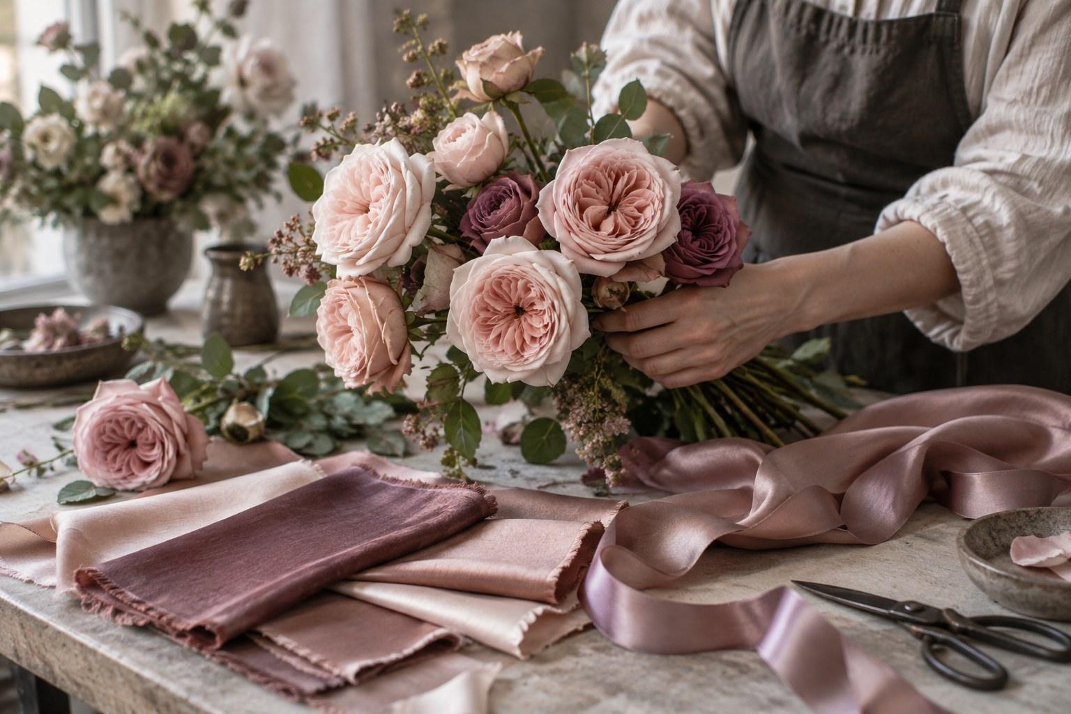
A swatch is any physical sample of the colours that matter. Ask for them at your first or second consultation, well before you place a flower order. The best sources:
- Fabric from the bridesmaid dresses — most dressmakers and bridal stores can supply an offcut or a sample swatch
- Ribbon the couple has chosen for bouquets, stationery or favours
- Paint chips from a hardware store that the client has matched to their palette
- Invitation stock or an envelope liner from their stationer
- Linen or napkin samples from the hire company
Label every swatch and keep them together in one envelope. At the wholesaler at 5am, you want them in your hand — not buried in your inbox.
View colour in daylight — and in the venue’s evening light
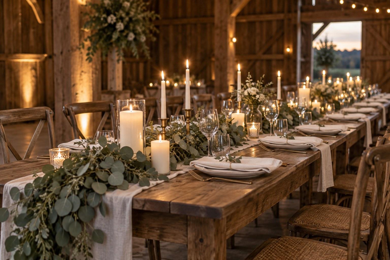
Compare flowers to swatches in soft natural daylight first, ideally indirect light near a window. That’s your honest baseline. Then think about where the flowers will actually live. Warm candles and fairy lights can push blush towards peach and make cool lilacs look grey. Ask the venue or stylist what the evening lighting will be, and check a stem against the swatch under similar light if you can.
Name colours precisely: dusty pink vs blush vs mauve
Colour words are slippery. To one client “blush” means barely-there pink; to another it’s a warm peachy nude. “Dusty pink” might mean greyed-down rose or something closer to mauve.
Don’t guess. Put real stems or swatches in front of the client and ask them to point. Then write down the colour names you will both use, tied to the physical samples: “Blush = swatch A, the ribbon. Mauve = swatch B, the bridesmaid fabric.” That shared vocabulary goes into your proposal, so nobody is arguing about adjectives two weeks out.
Natural variation in flowers: set expectations in writing
Here’s the honest truth every florist needs to tell every client: flowers are not paint. The same variety can come in noticeably different shades depending on the grower, the season, the weather and the conditions it was grown in. A bloom also changes as it opens — many roses deepen or fade as they mature, and some varieties shift tone noticeably over a couple of days in the cooler.
Your proposal should say this clearly. Something like: “Flowers are natural products, and colour varies between growers, seasons and stages of bloom. We’ll match your palette as closely as possible using the swatches provided.” Put it in writing before they sign, not after the bouquet is delivered.
Add a substitution clause to your proposal
Alongside the variation note, include a substitution clause: if a specific variety is unavailable or the crop comes in off-colour, you’ll substitute a flower of similar colour, style and value. Clients sign up for a look, not a stem count — the clause lets you protect that look.
What about dyed or tinted flowers?
Dyed and tinted blooms exist, and occasionally they solve a tricky brief. But they can look artificial up close, and dye can transfer onto hands or fabric. Avoid them unless the client has seen examples and agreed in writing.
Build a wedding flower palette with depth
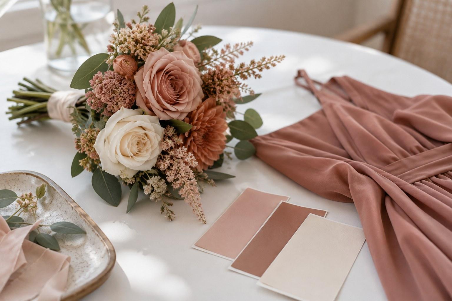
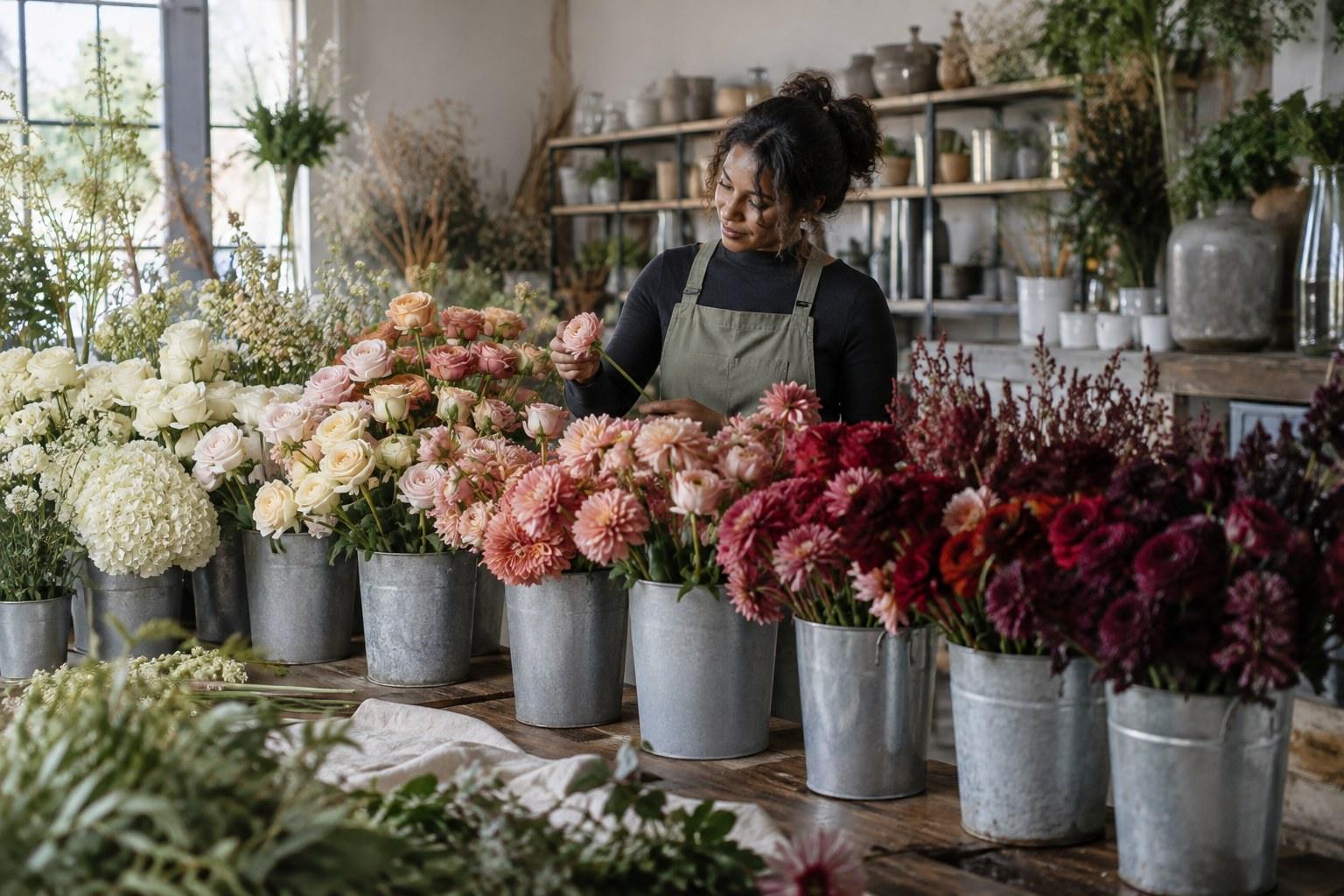
The fastest way to make wedding flowers look flat is to match every stem to one exact shade. Real depth comes from layering. Think of your palette in four parts:
- The main colour — the hero shade the client fell in love with, usually tied directly to the swatch.
- Tonal shades — lighter and darker versions of that colour, so the eye travels across the arrangement.
- Accents — a small amount of a contrasting or deeper colour that makes the main shade pop.
- Greenery as a colour — silver-blue eucalyptus, bright fern, olive and deep glossy foliage all read differently. Choose foliage on purpose, not as filler.
This is the same design thinking taught inside our Certificate in Floral Design — palette-building isn’t an extra, it’s the backbone of every design you’ll sell.
Using the colour wheel for wedding flowers
The colour wheel gives you a language for explaining your choices to clients — and a quick way to sanity-check a palette. Three approaches cover most wedding briefs:
| Palette approach | How it looks | Best for |
|---|---|---|
| Tonal (monochromatic) | Many shades of one colour, from pale to deep — calm, refined, cohesive | Minimal or classic weddings; clients who want “all blush” or “all white” without it looking flat |
| Analogous | Neighbouring colours on the wheel, like peach, coral and dusty pink — soft, warm and blended | Garden and romantic styles; palettes built from a single bridesmaid fabric |
| Complementary | Opposites on the wheel, like burgundy with sage, or orange with blue — bold, high-contrast | Statement weddings, editorial styling and couples who want energy |
| Neutral with accent | Cream, white and green with one pop colour pulled from the swatch | Clients nervous about colour; venues with strong existing colour |
Tell the client which approach you’re using. When they understand that the burgundy accent is there to make their sage linen sing, they stop asking why “the bridesmaid colour” isn’t in every single stem.
Test bunches and mock-ups: proof the palette before the wedding
For anything beyond a simple brief, make a test bunch or mock-up. A small posy with the main colour, tonal shades, accents and foliage is enough to prove the palette works.
Lay it next to the swatches and photograph it in neutral daylight against a plain white or grey background. Keep filters off and skip the editing. That way, if the client views the photo on their phone, at least you’ve removed the variables you control. Better still, have them see it in person.
Communicating colour to your flower wholesaler
Your wholesaler is your colour-matching partner, so treat them like one. Bring swatches to the market when you can. When ordering remotely, give variety names and describe the colour in plain terms — “warm blush, not cool pink” — and ask your rep to flag if a crop is running lighter, darker or off-tone.
For colour-critical weddings, order early enough for blooms to open so you see their true shade. And always have a second-choice variety in mind for every key colour. That backup is what makes your substitution clause actually workable.
When not to match exactly: blending vs matching
Sometimes the best answer is not to match at all. If bridesmaids are wearing a strong colour, bouquets in that identical shade can disappear against the dress in photos. A blend — a few tones lighter, a touch of contrast, more cream or green — often frames the dress better than a perfect match.
The same goes for the wider styling. Flowers, linen, candles and stationery should feel like a family, not identical twins. This is where floristry meets styling, and why many florists add the Certificate in Wedding Styling — to read the whole room, not just the vase.
Wedding flower colour matching mistakes to avoid
- Approving from a phone screen. Never let a client sign off — or sign off yourself — on colour from a photo alone.
- Ignoring the lighting. Daylight, candlelight and LED uplighting all change how a bloom reads. Plan for the light the flowers will live in.
- Matching too literally. One flat shade from bouquet to centrepiece looks lifeless. Build tonal depth.
- No variation clause. If you haven’t told the client flowers vary, you’ll be explaining it on the wedding morning.
- Forgetting the greenery. Foliage takes up a lot of visual space. The wrong green can pull a whole palette off-tone.
Want a practical reference for your studio bench? The Wedding Florist’s Handbook ebook covers the working side of wedding floristry, from consults to delivery.
And if you’re aiming to offer planning, styling and flowers under one roof, the Advanced Certificate in Wedding Planning, Styling and Business brings them together with the business side.
Wedding flower colour matching FAQs
How do florists match flowers to a bridesmaid dress?
Ask for a physical fabric swatch from the dressmaker or bridal store, then compare stems against it in natural daylight. Build tonal shades and accents around the dress colour rather than matching one exact shade, so the bouquet stands out against the fabric instead of disappearing.
Can I match wedding flowers from a photo?
Use photos for mood and style only. Screen calibration, filters and lighting all change how colour appears, so always confirm the palette with a physical swatch such as fabric, ribbon, a paint chip or invitation stock.
Why don’t my wedding flowers look like the sample?
Flowers are natural products. The same variety can vary in shade by grower, season and how open the bloom is. That’s why professional florists explain natural variation and include a substitution clause in writing before the client signs.
Should wedding flowers match exactly or blend?
Usually blend. A tonal or analogous palette with accents and considered greenery looks richer than a single matched shade, and it photographs better against dresses and linen in the same colour.
Is it okay to use dyed flowers to hit a wedding colour?
Only with the client’s agreement. Dyed blooms can look artificial up close and dye may transfer onto skin or fabric, so show examples and get written approval before using them.
Colour is where clients feel your expertise most — they may not know the word “analogous,” but they know when a bouquet looks right. Ready to design with that kind of confidence? Enrol in the Certificate in Floral Design and start building your wedding floristry skills today. 💐