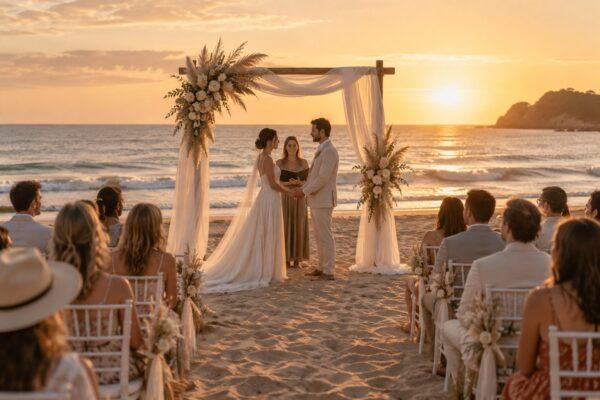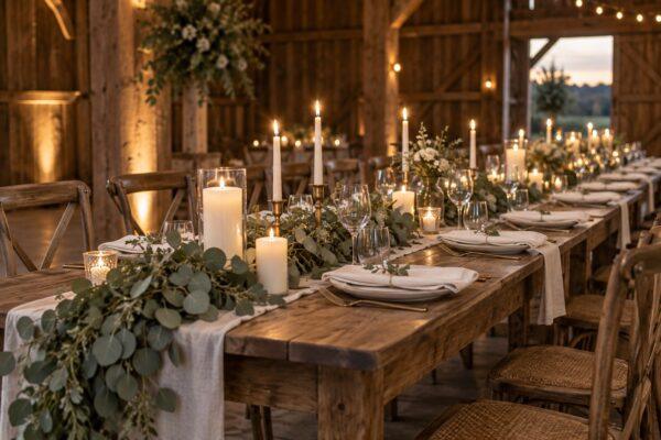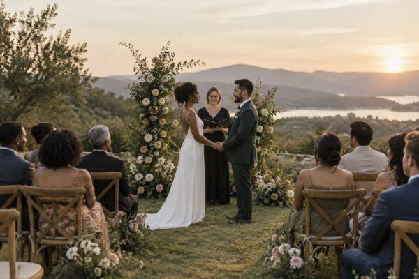
You spend hours sourcing the perfect Italian linens, building lush, organic floral arrangements, and curating an editorial tablescape that looks breathtaking in person. Then the gallery arrives from the photographer, and your heart sinks. The details look muddy, the intricate textures blend into a single washed-out wash of beige, and that sophisticated palette loses all its depth. This is where a deep dive into wedding styling colour theory changes everything about how your physical designs translate onto digital media and print portfolios.
The human eye and a camera sensor experience the world through entirely different mechanisms. While our brains naturally adjust for lighting shifts, shadows, and subtle tonal nuances, digital sensors flatten contrast and interpret colour based on light temperature and exposure values. If you design strictly for how a room looks to the naked eye without accounting for how a lens compresses light and shadow, even the most expensive decor components will look flat, dull, and uninspired in the final album.
Clients judge your capabilities almost entirely through your photography portfolio. If your colour stories fail to pop on a screen, you lose prospective bookings—no matter how magical the event felt when walking through the room. Mastering wedding styling colour theory bridges the gap between physical aesthetics and photographic impact. By understanding how hues interact, how saturation behaves under various lighting conditions, and how to build tonal contrast, you can create designs that look stunning both in real life and through any camera lens.
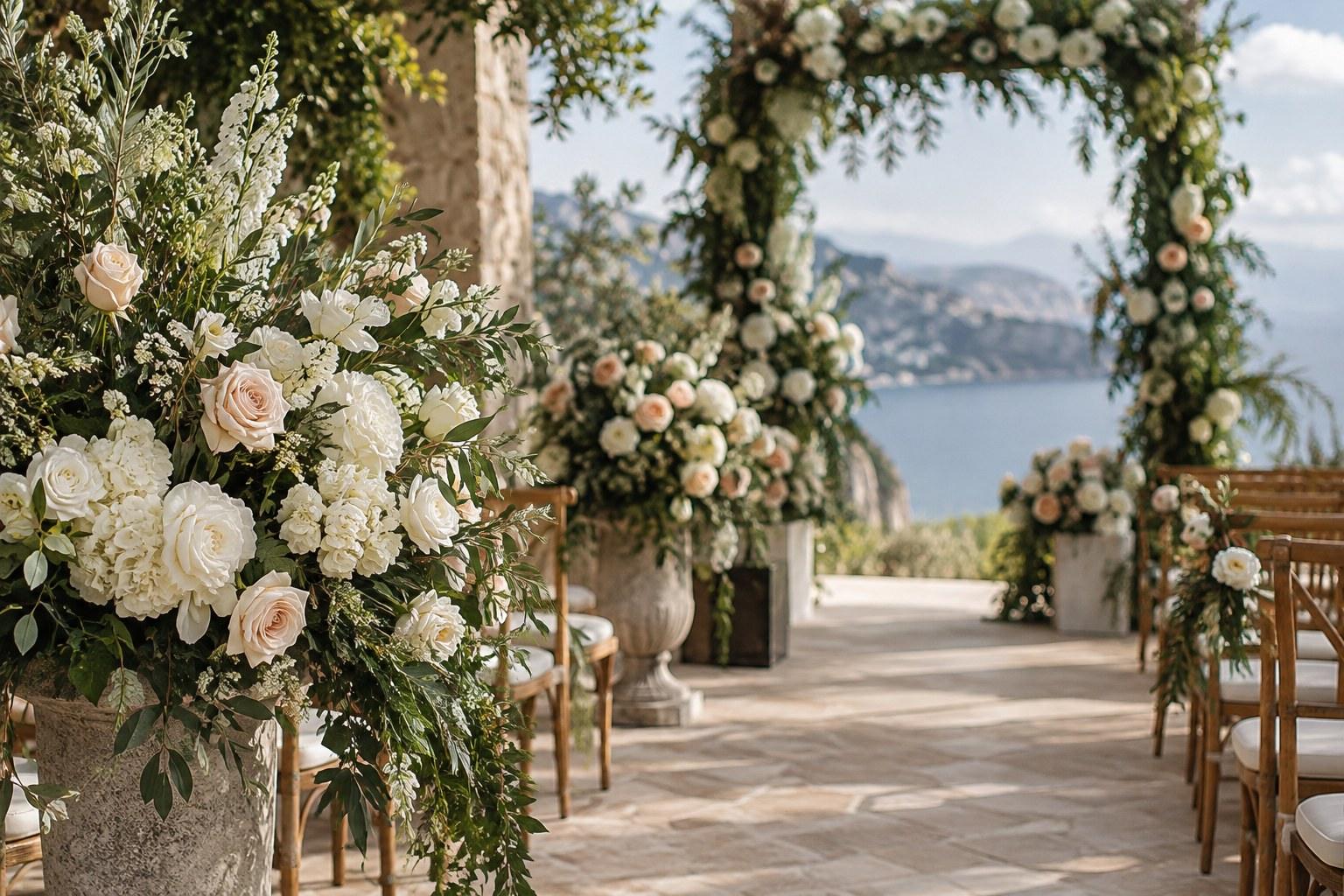
How Camera Sensors Read Colour Differently Than Your Eyes
When you stand inside a reception space, your binocular vision and brain work overtime to create a balanced, high-contrast visual experience. You notice the subtle shift between a warm cream napkin and a slightly cooler ivory charger plate. A camera sensor, however, measures raw light data mathematically. Without sufficient tonal separation, closely related shades collapse into a single amorphous block of colour in a photograph, destroying all your painstaking curation.
The Problem with Low-Contrast Monochromatic Palettes
Monochromatic design is a staple of luxury styling, featuring gradients of a single colour family like taupe, cream, and sand. In person, these variations provide a serene, tactile elegance. On camera, unless there is a dramatic variance in value—how light or dark a colour is—the entire tablescape blurs together. The camera lens requires sharp edges, clear separation, and distinct tonal steps to read depth in a two-dimensional image. When everything sits in the exact same narrow value band, the photo loses all dimension.
Dynamic Range and Shadow Clipping
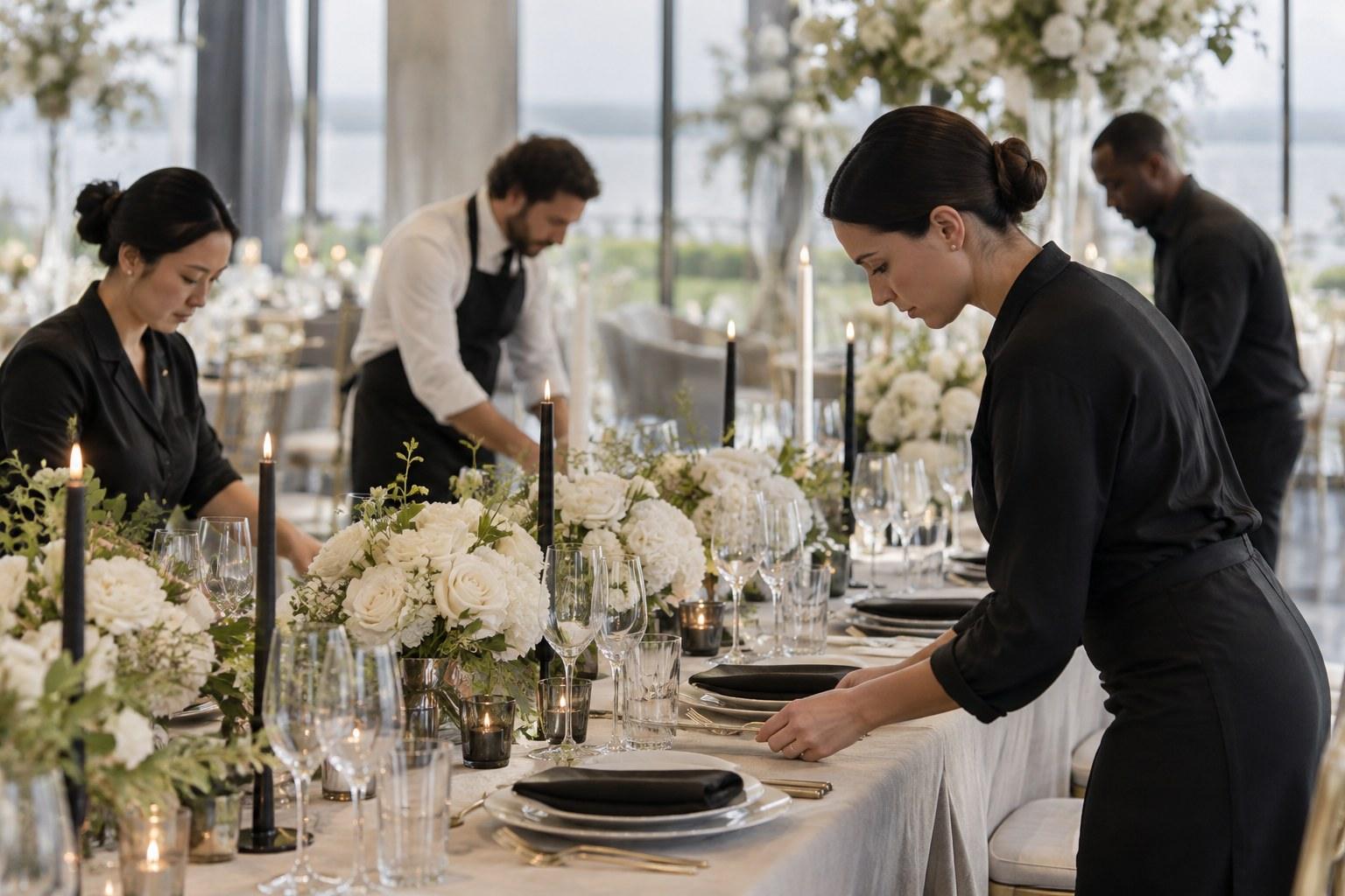
Cameras struggle with extreme dynamic range—the span between the brightest highlights and the deepest shadows in a given scene. When you pair ultra-dark elements like black velvet linens with stark white tableware without a middle tone to bridge the gap, the camera sensor is forced to make a compromise. It either blows out the highlights into a blinding white or clips the shadows into a pitch-black void, erasing all texture, pattern, and delicate detail from your carefully styled vignettes.
The Role of Saturation and Value in Wedding Styling Colour Theory
Colour has three primary dimensions: hue, saturation, and value. When applying wedding styling colour theory, value and saturation matter far more for photography than hue selection alone. Two colours with identical saturation levels will compete for visual dominance on film, creating a vibrating, jarring optical effect that makes images uncomfortable to look at.
High Saturation vs. Muted Tones Under Direct Light
Vibrant, highly saturated primary colours absorb and reflect light aggressively. In direct sunlight or intense artificial spotlights, saturated hues can easily overwhelm a frame, causing colour fringing or bleeding onto surrounding neutral surfaces—such as a bright red runner casting an unwanted pink cast onto white ceramic plates. Muted tones, conversely, contain grey or brown undertones that absorb harsh light gracefully, but they require careful value scaling to avoid looking dull or depressing on camera.
To help visualize how physical styling choices translate onto digital sensors, consider the following breakdown of common aesthetic challenges and their photographic outcomes:
| Palette Approach | In-Person Appearance | Camera Result | Styling Adjustment |
|---|---|---|---|
| All-Neutrals (Cream, Ivory, Beige) | Serene, high-end, tactile | Washed out, flat, zero definition | Introduce deep charcoal or bronze accents for tonal contrast |
| High Contrast (Black and Stark White) | Modern, graphic, bold | Blown highlights and clipped shadow details | Add mid-tone greys, textures, or candlelight to bridge the gap |
| Tone-on-Tone Pastels (Blush and Peach) | Romantic, soft, delicate | Looks entirely white or overly sickly sweet | Ground with deeper greenery or earthy copper elements |
| Bright Jewel Tones (Emerald, Sapphire) | Opulent, rich, dramatic | Shadows clip instantly; loses fabric texture | Incorporate metallic sheens and directional pin-spot lighting |
Simultaneous Contrast: Why Colours Shift Next to Each Other
Joseph Albers famously demonstrated that colours never look the same depending on their context. A soft grey ribbon wrapped around a bright yellow menu card will suddenly take on a distinct purple undertone due to simultaneous contrast. In event design, this optical illusion can completely derail your palette if you choose components in isolation without testing how they interact side-by-side.
Neutralizing Undesirable Casts from Surrounding Surfaces
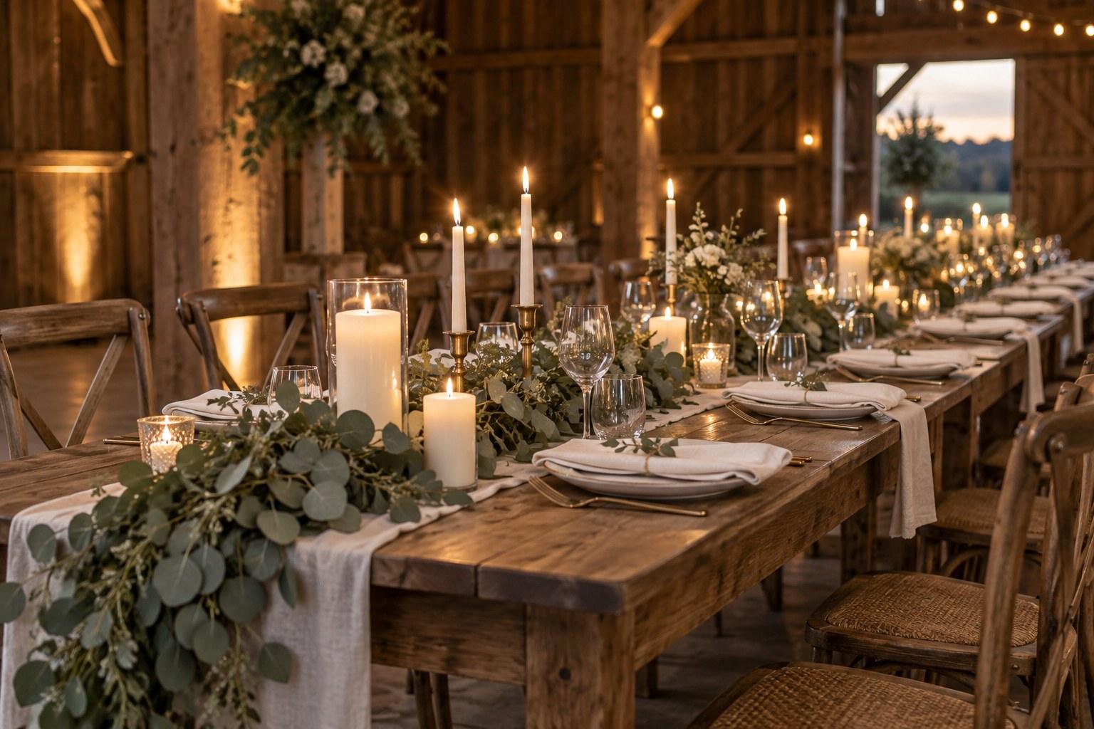
Venue walls, wooden floors, and expansive carpet patterns bounce ambient light onto your tablescapes. If a room has warm wooden paneling or red brick walls, it will cast an amber or crimson glow onto neutral linens, shifting ivories into muddy yellows or dirty pinks. Factoring in environmental colour reflection is a vital pillar of advanced wedding styling colour theory, ensuring your palette remains true regardless of the room’s permanent architecture.
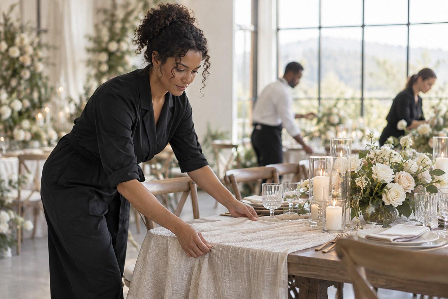
Common Mistakes That Kill Your Palette in Photos
Even experienced professionals sometimes fall into traps that compromise their hard work behind the camera. One major error is styling entirely for the mood board without checking how fabrics react to flash photography or harsh ambient lighting. Shiny satin, glossy ceramics, and reflective metals act like mirrors, creating distracting hot spots and glare that blow out fine details in professional galleries.
Another frequent misstep is ignoring the structural foundation of the venue. A bold, cool-toned palette placed inside an aggressively warm room creates a visual clash that confuses the camera’s white balance. Successful design requires looking at the holistic environment rather than treating a table as an isolated island.
Balancing Event Logistics and Visual Impact
A truly cohesive event requires seamless collaboration between the visual design and the underlying logistical timeline. Understanding how to manage vendors, floor plans, and spatial flow ensures that your styling elements are positioned to catch optimal light throughout an event. For those looking to master both the structural side of events and the creative direction, exploring a certificate-in-wedding-planning offers incredible insight into how planning and styling intersect on a practical level.
Elevating Your Styling Portfolio with Intentional Colour
When you master the science of how cameras interpret palettes, your entire portfolio transforms. You stop relying on luck and start engineering visuals that command attention online and in print. Every linen choice, floral recipe, and tabletop component becomes a deliberate tool designed to photograph with absolute clarity and depth.
Take Your Design Skills Further
If you are ready to stop guessing why your portfolios look flat and start creating intentional, camera-ready spaces every single time, it is time to formalize your expertise. Elevate your creative career, master advanced visual principles, and learn how to translate any aesthetic into stunning photographic imagery through the Certificate in Wedding Styling.
FAQs
Why do wedding colour palettes look different in photos than in person?
Cameras compress dynamic range and read raw light mathematically, whereas human eyes and brains dynamically adjust for shadows and tonal variations. Without strong tonal contrast, closely related shades collapse into a flat, washed-out mass on camera.
What is the biggest colour mistake stylists make with photography?
Styling entirely for in-person impact without accounting for how reflective fabrics, glossy finishes, and lighting temperatures create hot spots or alter hue perceptions on digital sensors.
How do I fix a monochromatic palette so it photographs well?
Introduce deep or contrasting accent elements—such as charcoal, bronze, or rich textures—that provide necessary value variation so the camera lens can easily distinguish edges and depth.
Why do neutral linens look yellow or muddy in some reception venues?
Environmental colour reflection causes surrounding architecture, like warm wooden walls or red brick, to bounce ambient light onto your tablescapes, shifting neutral tones into unexpected hues.
How does learning colour theory improve my styling business?
Understanding advanced visual principles ensures your portfolio images feature sharp clarity and rich depth, helping you attract high-end clients who value editorial precision.