Most wedding planner websites look lovely and say almost nothing. Beautiful photos, a script font, and a headline like “Creating timeless celebrations with love.” It could belong to anyone, anywhere — which is exactly why a couple scrolls past it and opens the next tab.
Your wedding planner website copy has one job: help the right couple decide, quickly, that you’re worth an enquiry. Not to impress other planners. Not to list every qualification you’ve ever earned. To make a nervous, newly engaged person feel understood and know exactly what to do next.
Here’s what to write on every page — home, about, services, portfolio, process, reviews, FAQ, contact and blog — with the same logic working just as well if you’re a stylist, florist or coordinator. 💻
What wedding planner website copy actually needs to do
Before you write a word, get clear on the visitor. They’ve probably just got engaged, they’re overwhelmed, and they’re comparing several suppliers at once. They’re asking three questions, usually in this order:
- Is this for me? — the right kind of wedding, the right location, the right style.
- Can I trust them? — real weddings, real reviews, a real human behind the business.
- What do I do now? — one obvious, low-pressure next step.
Every page on your site should answer at least one of those questions. If a paragraph doesn’t, cut it. This is the core of what we teach in the Certificate in Wedding Business Marketing — marketing that starts with the client’s head, not your own.
Home page copy for wedding planners: one clear line above the fold
The top of your home page — what people see before they scroll — needs three things: who you help, where you work, and a button to enquire. That’s it. Everything else can wait further down.
Before and after: rewriting a generic headline
Before: “Bespoke wedding planning for unforgettable moments.”
After: “Full wedding planning for couples marrying in [your region] — so you can enjoy being engaged instead of managing spreadsheets.”
The “after” version tells the couple what you do, where you do it, and what their life looks like once they hire you. It also includes your service and location — the words people actually search for.
Under the headline, add a short line of proof (a couple of words from a real review, or the type of weddings you’re known for), then a quick path to your services. Keep the primary call to action consistent across the site: “Enquire about your date” or “Check my availability” both beat a vague “Learn more.”
About page: written for the couple, not your CV
Here’s the uncomfortable truth — your about page isn’t really about you. Couples read it to decide whether they’d enjoy spending months working with you. So write it in answer to their question: “Why should I trust you with this?”
- Why you do this work — one honest story beats three paragraphs of adjectives.
- How you work — calm and structured? Hands-on with styling? Say it, then show it.
- Who you’re best for — and, gently, who you’re not.
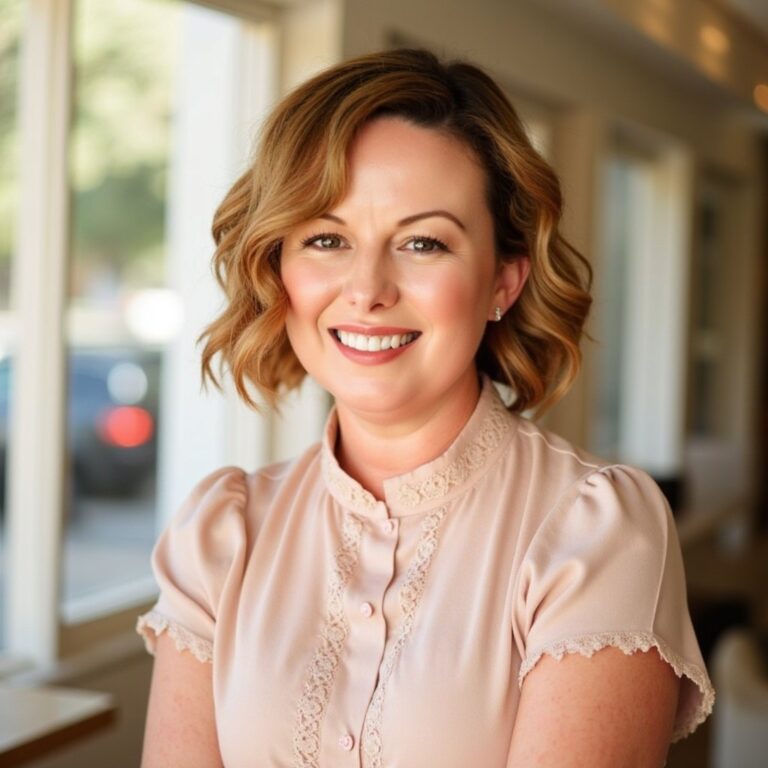
- A real photo of you — smiling, natural, ideally at work. Not a stock image, not your logo.
Your training and experience belong here too, but frame them as reassurance for the couple: “I’m trained in contracts, timelines and supplier management, so you don’t have to be.”

Services page copy: what each package solves
Most services pages are task lists: “venue sourcing, supplier liaison, on-the-day coordination.” Accurate — and dull. Couples don’t buy tasks; they buy a problem taken off their plate. For each package, write three short parts:
- Who it’s for — “You’ve booked your venue and most suppliers, but you want someone else running the day.”
- What it solves — “You and your family get to be guests at your own wedding.”
- What’s included — the task list, now that they care about it.
Should wedding planners show pricing on their website?
Honestly, it’s your call — and both choices are legitimate. Showing pricing or a “starting from” figure filters out couples who aren’t a fit, saves you discovery calls that go nowhere, and signals confidence. Leaving it off gives you room to quote properly for weddings that vary wildly in scope, and invites a conversation where you can explain your value first. The middle ground many businesses use is a clear sentence about how pricing works — what it’s based on and when they’ll get a quote — so nobody feels like you’re hiding something. Whatever you pick, don’t make couples hunt for the answer.
Portfolio and real weddings: tell the story
A gallery of beautiful photos with no words wastes your best sales asset. Add story captions: what the couple wanted, what made it tricky, how you solved it. “A garden ceremony with a rain plan we actually needed — here’s how we flipped the whole setup in under an hour” sells your skill far better than “Gorgeous garden wedding.”
Use couples’ names only with their permission, and always credit the other suppliers — photographer, venue, florist, stylist. It’s good manners and it builds goodwill in your network.
Process page: “how it works” in steps
This is the page most planners skip — and it’s one of the most persuasive. Couples who’ve never hired a planner don’t know what happens after they enquire, and uncertainty is a quiet reason people don’t press the button. Lay it out in simple numbered steps: enquiry, discovery call, proposal, booking, planning phase, final details, the wedding day, wrap-up. One or two sentences each. Suddenly the whole thing feels manageable.
Reviews, FAQs and the contact page
Reviews: only real ones, with permission
Never write, polish into fiction, or “borrow” testimonials. Use real reviews with the couple’s permission, and pick the ones that mention a specific moment or feeling — “she spotted the problem before we did” — over generic praise. A handful of honest reviews beats a wall of vague ones.
FAQ page: answer the questions couples actually ask
Pull your FAQs straight from your inbox and discovery calls. How far ahead should we book? Do you travel? Do you work with our chosen suppliers? What happens if something goes wrong on the day? Clear, direct answers reduce back-and-forth emails — and because they match how people phrase questions, they also help with search engines and AI assistants that look for pages answering real questions.
Contact and enquiry page: short form, clear expectations
Ask only what you need to respond well: names, email, date (or rough timing), location, guest numbers and a free-text box. Then tell them what happens next — when they’ll hear from you and what that reply will include. A long form feels like homework.
Wedding planner website copy checklist, page by page
| Page | Job of the page | Must-have copy |
|---|---|---|
| Home | Tell the right couple they’re in the right place | Who you help + where, primary enquire button above the fold, proof, path to services |
| About | Build trust in you as a person | Why you do it, how you work, who you’re best for, a real photo |
| Services | Match couples to the right package | Who each package is for, what it solves, what’s included, how pricing works |
| Portfolio / real weddings | Prove you can deliver | Story captions, names with permission, supplier credits |
| Process | Remove uncertainty about hiring you | Numbered steps from enquiry to wrap-up |
| Reviews | Let past couples speak for you | Real, permissioned reviews with specific moments |
| FAQ | Answer objections before they’re raised | Real questions from your inbox, direct answers |
| Contact | Turn interest into an enquiry | Short form, reply-time promise, what happens next |
| Blog | Get found and show expertise | Topics couples search, linked back to services and contact |
Blog copy: write what couples are searching for
Your blog isn’t a diary. It’s how couples find you before they know your name. Write about the questions they type into search — choosing a venue in your area, building a realistic timeline, what a coordinator actually does on the day — and end every post with a link to your services or contact page. If you want a structured approach to content, positioning and getting found, the Wedding Business Marketing Handbook ebook walks through it step by step.
How to write wedding planner website copy that sounds like you
- Write like you talk. Read it out loud. If you’d never say it to a couple over coffee, rewrite it.
- Use “you” more than “I”. Couple-first language keeps the focus on their wedding, not your business.
- Be specific, not vague. Everyone claims to be “calm” and “organised.” Prove it — describe your planning system, your run sheets, the rain plan you always prepare.
- Use keywords naturally. Your service plus your location (“wedding planner in [town]”) in headings, page titles and the first paragraph — never stuffed.
- Write meta titles and descriptions for every page. They’re the copy people see in search results before they ever reach your site.
- Put a call to action on every page. Nobody should finish reading and wonder what to do next.
- Make it accessible. Descriptive alt text on images, readable font sizes, strong contrast and clear link text. Script fonts are for accents, not paragraphs.
Common wedding website copy mistakes
- It’s all about you. Count the “I”s and “we”s versus the “you”s. Flip the ratio.
- No location. If a couple can’t tell where you work within seconds, they’ll assume you don’t work near them.
- A buried contact page. Enquiry buttons belong in the header, mid-page and at the bottom.
- Stock photos. Couples can spot them instantly, and they quietly undermine trust. Use your own work and your own face.
- A wall of adjectives. “Elegant, timeless, bespoke, luxurious, personalised” tells nobody anything. One concrete example beats five adjectives.
Fix these and your site starts working while you sleep. Planners, stylists and florists who want the full marketing toolkit — positioning, content, social and enquiry handling — will find it inside the Certificate in Wedding Business Marketing. And if you’re still building the planning skills behind the promises on your site, the Certificate in Wedding Planning is the place to start.
Wedding planner website copy FAQs
What should a wedding planner put on their home page?
One clear line saying who you help and where you work, a primary enquiry button above the fold, a short piece of proof such as a real review, and a quick path to your services. Keep everything else further down the page.
Should wedding planners show prices on their website?
It’s a business choice. Showing pricing or a “starting from” figure filters enquiries and signals confidence; leaving it off gives you room to quote custom work. If you don’t show figures, explain how pricing works and when couples will receive a quote.
How long should wedding planner website copy be?
Long enough to answer the couple’s questions and no longer. Home and contact pages should be short and scannable; services, process, FAQ and blog pages can go deeper because couples read them when they’re seriously comparing options.
Can I use stock photos on my wedding planner website?
Avoid them where you can. Couples want to see your real work and the real person they’ll be hiring. Use your own wedding photos with photographer credit and permission, plus a genuine photo of you.
Does the same website copy advice apply to stylists and florists?
Yes. Whatever your service, the same structure works: say who you help and where, show real work with story captions, explain your process, answer real questions and make enquiring easy on every page.
Ready to turn your website — and the rest of your marketing — into a steady source of enquiries? Learn the whole system inside the Certificate in Wedding Business Marketing, or go further with the Advanced Certificate in Wedding Planning, Styling and Business.