
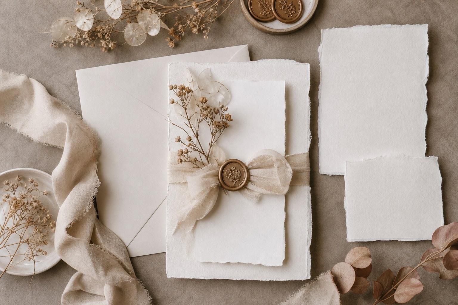
Paper is the first thing a guest touches and the last thing they take home. The save the date sets the expectation, the invitation sets the tone, the welcome sign sets the mood at the gate — and the menu card ends up photographed on a linen napkin in the couple’s gallery forever. Get the paper wrong and the whole design reads like three different weddings stapled together.
Which is why wedding stationery styling is a stylist’s job, not a printer’s job. Anyone can order invitations. Your value is deciding what the paper says about the day before a single word is read — the weight of the stock, the ink colour, the ribbon, the way a welcome sign echoes the invitation your guests opened eight months earlier.
Here’s how to build a cohesive paper suite from first mood board to the last place card, and how to sell it as a proper line item instead of quietly absorbing the work.
What a wedding stationery suite actually includes
Couples say “invitations” and mean about fourteen pieces. Before you style anything, get the full inventory on paper — because the pieces you forget are the ones that get ordered in a panic from a completely different supplier in a completely different font. That’s how cohesion dies.
- Pre-day: save the date, invitation, details or information card, RSVP card, envelopes, wedding website card
- Ceremony: welcome sign, order of service or ceremony program, reserved seating cards, unplugged ceremony sign
- Reception: seating chart or escort cards, place cards, menu cards, table numbers or names, bar or signature drinks sign, cake and dessert labels, guest book signage
- Extras: favour tags, napkin bands, thank you cards, late-night snack signage, directional signs for parking and bathrooms
Write that list into your proposal and mark each piece as included, optional or client-supplied. Every “we’ll figure it out later” item becomes an unpaid hour of yours in the final fortnight — and usually an aesthetic compromise you’ll be blamed for.
Build the paper suite from one design system
Cohesion isn’t “everything matches”. Matching is boring and it flattens a design. Cohesion is everything drawing from the same small system — and then varying inside it. Lock four things before you approve a single proof:
- Two typefaces, maximum three. One display or script for names and headers, one clean workhorse for body copy and details. Give each a fixed job and never swap them mid-suite.
- A colour palette of three to four inks. A base, a text colour, an accent. Specify them properly — a printed swatch or a Pantone reference, not “sage” — because sage on your screen and sage at the print shop are two different plants.
- One texture story. Handmade deckle edge, smooth cotton, vellum overlay, linen finish. Pick a lane. Mixing four stocks reads as indecision, not layering.
- One motif. A monogram, a pressed flower, a line drawing of the venue, a wax seal colour. Repeat it at three different scales across the suite — tiny on the place card, large on the welcome sign.
That’s the whole trick. When those four decisions are fixed, you can put a hand-torn invitation next to an acrylic table number and it still feels like one wedding — because the ink, the type and the motif are carrying the thread. This is the same design-system logic we teach across the Certificate in Wedding Styling: decide the rules once, then apply them everywhere without re-deciding.
How to choose paper stock without wrecking the budget
Stock is where couples overspend for the least visible return, so steer it. Put the money into the pieces guests handle and photograph — the invitation and the menu — and go simpler on the pieces that live at distance, like directional signage nobody inspects at close range.
Heavier isn’t automatically better either. A thick cotton card with letterpress feels like an heirloom. That same weight on twelve signs is dead money. And always, always order the sample pack before the couple falls in love with a stock on a screen — paper is a tactile purchase and screens lie about colour.
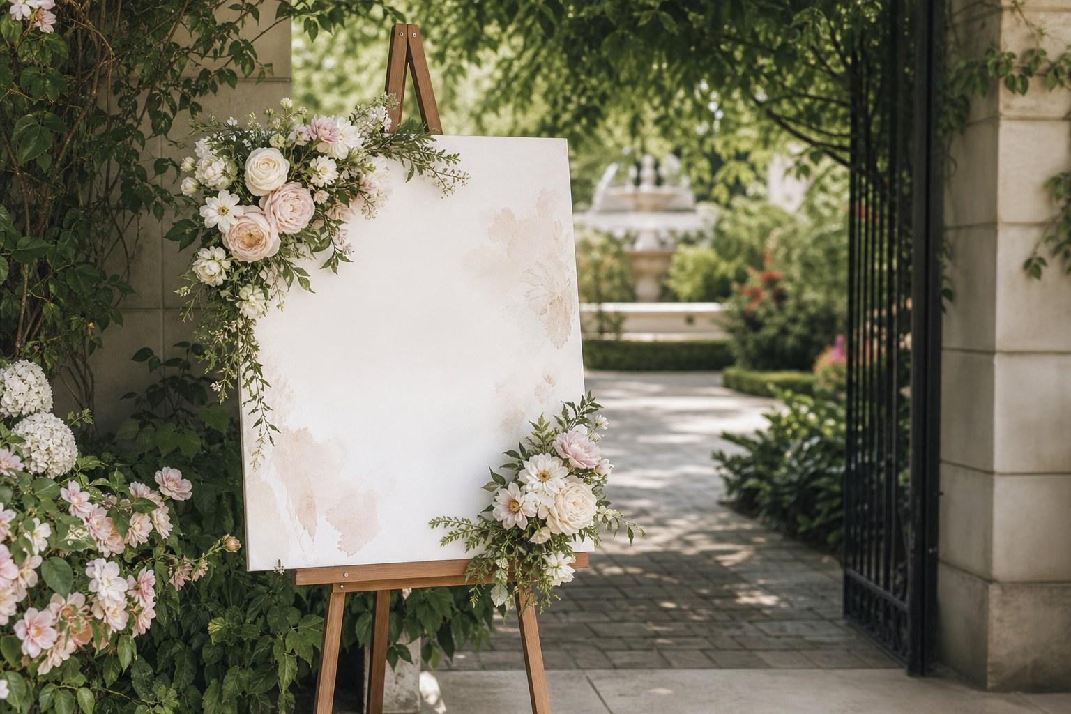
Wedding signage styling: make it readable first, pretty second
Signage is where beautiful design most often fails, because designers style it at desk distance and guests read it from three metres away, at dusk, holding a drink. If a sign has a job — direct, inform, welcome — legibility outranks elegance every time.
- Contrast beats trend. White script on clear acrylic looks stunning in a flat lay and disappears against a hedge. Back it, mount it, or change the ink.
- Hierarchy in three levels. Headline, then key information, then the fine print. If everything is the same size, nothing gets read.
- Fewer words. A welcome sign is not a program. Names, date, one line of warmth. Move the detail to something guests can hold.
- Plan the structure. Easel, stand, frame, hanging point — and wind. An A1 sign on a lightweight easel in an open garden is a face-plant waiting for the ceremony processional.
- Style the base. A gorgeous sign on a bare tripod leg looks unfinished. Florals, greenery, a plinth, a scatter of candles — treat every sign as a small vignette.
Proof everything twice, then have a third person proof it. Names, dates, times, and every guest surname on the seating chart. A typo on a menu card is embarrassing. A misspelt surname on the seating chart is a story that family tells for a decade.
Printing methods compared: what to recommend and when
You don’t need to be a print technician, but you do need to speak the language well enough to steer a couple toward the right method — and to stop them ordering foil on a stock that can’t take it.
| Method | The look | Best for | Watch out for |
|---|---|---|---|
| Digital | Flat, sharp, full colour | Photos, watercolour art, large quantities, short lead times | Can look plain on its own — lift it with stock, edging or a seal |
| Letterpress | Deep impression you can feel | Heirloom, classic and formal suites on thick cotton | Needs soft thick stock; more colours means more plates |
| Foil | Metallic shine, high contrast | Monograms, names, dark or moody palettes | Can smudge fine detail; test on textured or coated stock first |
| Thermography | Raised glossy ink | Traditional looks on a tighter budget | Reads less refined up close than letterpress |
| Screen print | Opaque ink on any surface | Acrylic, timber, mirror and fabric signage | Longer lead times; setup costs per colour |
| Handwritten calligraphy | Genuinely one-off | Place cards, envelopes, small quantities | Slow — brief the calligrapher with a locked, final name list |
A smart mix usually wins: letterpress or foil on the invitation, digital on the details card, screen print on the signage. Same inks, same type, same motif — three methods, one suite.
How to style stationery on the day
Designing the suite is half the job. Placing it is the half that shows up in the photos — and the half couples never think to ask for until they see a menu card lying at a random angle in their gallery.
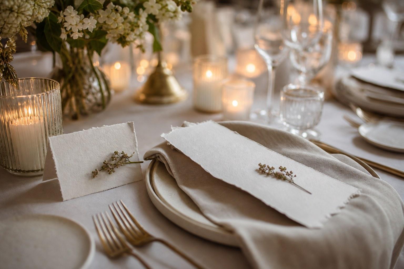
- Decide the place setting layout once, photograph it, and give that photo to your setup crew. Menu on the plate or under it, place card above or on the napkin, napkin band left or right — consistency across 150 covers is what makes a room look designed.
- Bring a styling kit for the flat lay: spare invitation suite, ribbon offcuts, loose florals from the florist’s scraps, the rings, a spare wax seal. Photographers shoot details early and they will ask.
- Send the full suite to the photographer before the day, and hand them a clean, unused set on the morning. Never let them shoot the crumpled one out of the couple’s glovebox.
- Weight everything outdoors. Menu cards and place cards travel in the lightest breeze. Napkin bands, small stones, a candle holder — solve it before service starts.
- Pack overs. Order at least a handful of spare place cards and menus, blank, plus a pen that matches the ink. Late changes always happen.
Build a stationery timeline your suppliers can actually meet
Paper is the most deadline-sensitive category you’ll manage, because it depends on other people’s information. You cannot print place cards until the seating plan is locked, and the seating plan can’t lock until the RSVPs are in. So work backwards, in this order:
- Lock the design system — type, ink, stock, motif — and get sample proofs approved in writing.
- Send save the dates as early as the couple’s guest list allows, especially for destination weddings.
- Order invitations with your printer’s stated lead time plus a buffer for a reprint, then mail with a clear RSVP cut-off.
- Design signage and menus while RSVPs come in — the artwork can be ready before the numbers are.
- Lock the seating plan, then release name-dependent pieces: place cards, escort cards, the seating chart.
- Collect everything yourself where you can, check it against the proofs, and pack it by location — ceremony box, entrance box, reception box.
That last point is unglamorous and it saves your day. Signage packed by room means your setup team isn’t unwrapping fourteen mystery parcels while the florist needs the trestle table. If you’re also handling the guest list side, the paper timeline and the planning timeline need to be one document — the process taught in the Certificate in Wedding Planning — and if you want the design, styling and business layers together, the Advanced Certificate in Wedding Planning, Styling and Business is the deeper path.
How to charge for wedding stationery styling
Most stylists give this work away. They “just help with the signage” and then spend two weeks art-directing a printer, proofing surnames and building a seating chart at midnight. Name it and bill it.
Two clean models. Design direction: you set the system, source and manage the supplier, proof everything and style it on the day — charged as a fee for your hours plus a management percentage on the print spend. Full supply: you supply the printed suite yourself at your trade rate with your margin built in, which suits stylists with a reliable printer relationship and hire signage in their inventory.
Whichever you pick, write revision limits into the contract — two rounds included, extra rounds charged — and make it clear that final proof approval sits with the couple in writing. Print errors after signed approval are a reprint cost, not your liability. It’s a boring clause that will save you a genuinely awful conversation one day.
Wedding stationery styling FAQs
What is a wedding stationery suite?
It’s the full set of printed pieces for a wedding, designed as one family — save the date, invitation, details and RSVP cards, envelopes, ceremony programs, welcome and directional signage, seating chart, place cards, menus, table numbers and thank you cards. A suite is defined by shared type, ink, stock and motif rather than by every piece looking identical.
How do you make wedding stationery and signage look cohesive?
Lock a small design system before you order anything: two or three typefaces with fixed jobs, three or four specified ink colours, one texture story and one repeating motif. Then vary the scale and format across pieces. Cohesion comes from repetition of those four elements, not from matching every item.
When should wedding invitations be sent?
Work backwards from the venue’s final numbers deadline: set an RSVP cut-off comfortably before it, then mail invitations far enough ahead that guests have time to reply and travel guests can book. Save the dates go out earlier still, particularly for destination and long-weekend weddings.
Do wedding stylists design the stationery themselves?
Some do, but most direct rather than draw. You set the design system, brief and manage a stationer or calligrapher, approve proofs and style the pieces on the day. That’s a paid service in its own right — and it’s often more valuable to the couple than the design work itself, because it’s the part that keeps everything consistent.
What are the most common wedding signage mistakes?
Poor contrast, too many words, no clear hierarchy, unstable stands outdoors, and an unstyled base. Add typos to that list — every name, date and time needs proofing by at least two people before anything goes to print, because a misspelt surname on a seating chart gets remembered.
Learn to style a wedding from the invitation to the last place card
Paper is the smallest thing in a wedding design and the one guests spend the most time looking at. Learn to build the system, brief the printer, protect the timeline and charge for the work, and stationery stops being an afterthought — it becomes one of the most profitable, most photographed parts of your service.
That’s exactly what the Certificate in Wedding Styling is built to teach you — design systems, colour and texture, styling on the day, and how to package it all as a professional service. Study online, at your own pace, with industry tutors. ✨



