Every couple arrives with a colour in their head. “Sage green and terracotta.” “Black tie, but warm.” “Something coastal.” Then you walk into the venue and the carpet is burgundy, the walls are apricot, and the reception room glows orange the second the sun drops. The palette that looked perfect on a screen has nowhere to live.
Choosing a wedding colour palette is not a mood board exercise. It is a design decision made against a real room, in real light, with a real budget. Get it right and every photograph looks intentional. Get it wrong and the day looks like three weddings arguing with each other.
Here’s the process professional stylists actually use — and if you want the full method, our Certificate in Wedding Styling teaches design fundamentals rather than trend-copying.
Start with the venue, not the palette
This is the rule that separates stylists from decorators. The venue is already a colour scheme, and it is a much bigger one than anything you’re adding. Before you propose a single hue, go and look at it — at roughly the time of day the wedding will happen.
Take photographs on your phone during the site visit and then look at them later on a laptop. You will notice colour casts your eye politely ignored while you were standing in the room.
How to build a wedding colour palette that works
Use a 60-30-10 structure
Borrow it from interior design: roughly 60% dominant colour, 30% secondary, 10% accent. In a wedding, the dominant colour is usually the largest surface area — linens, drapery, the wall or the greenery. The secondary sits in florals and stationery. The accent is the small hit of contrast: a candle colour, a ribbon, a napkin, a bloom.
Palettes fail when everything is given equal weight. Four colours at 25% each is not a palette, it’s a fight.
Pick a temperature and commit
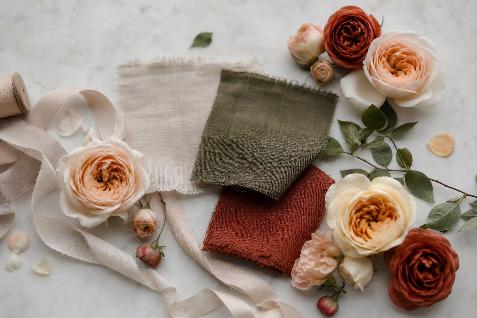
Warm palettes (terracotta, rust, butter, caramel, olive) and cool palettes (slate, dusty blue, sage-grey, lilac) behave completely differently in photography. Mixing temperatures without intent is the most common reason a room reads muddy. If you do mix, do it deliberately — one cool accent inside a warm scheme reads as sophisticated; a 50/50 split reads as indecision.
Add tonal range, not more colours
When a scheme feels flat, the instinct is to add another colour. Usually the fix is more tone: three depths of the same hue — a pale, a mid and a deep — will do far more for a tablescape than a fourth colour. This is exactly how florists build depth, and why a monochrome floral arrangement can still look rich.
Always include a neutral and a dark
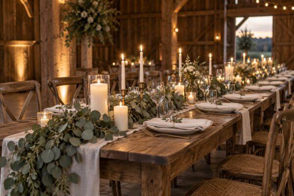
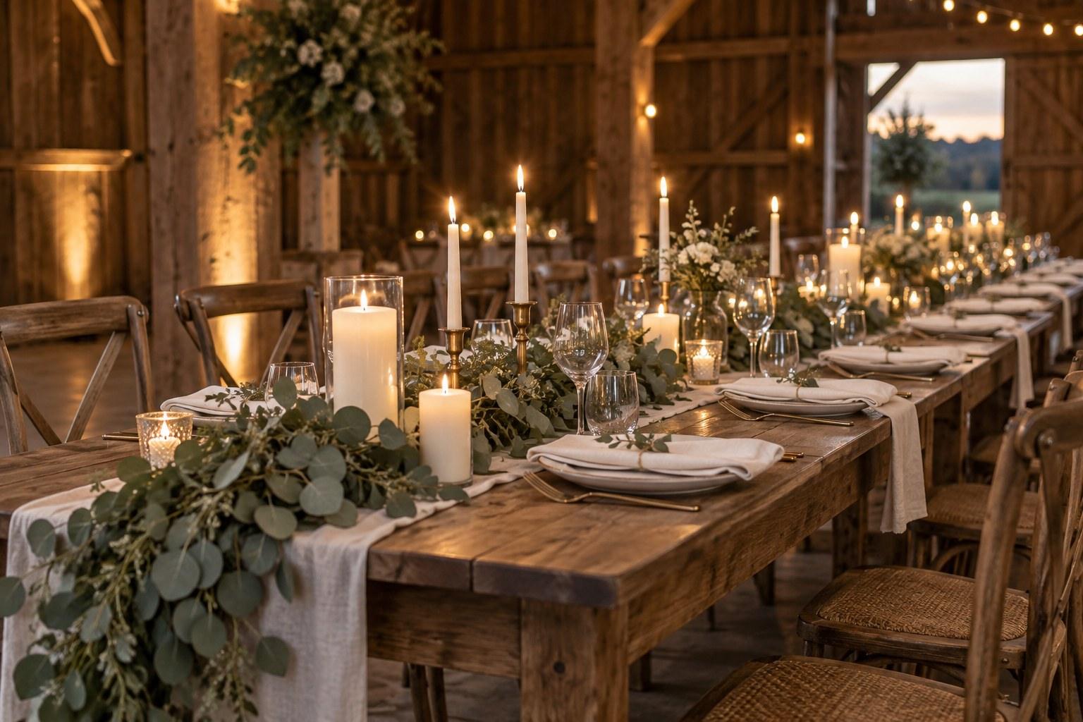
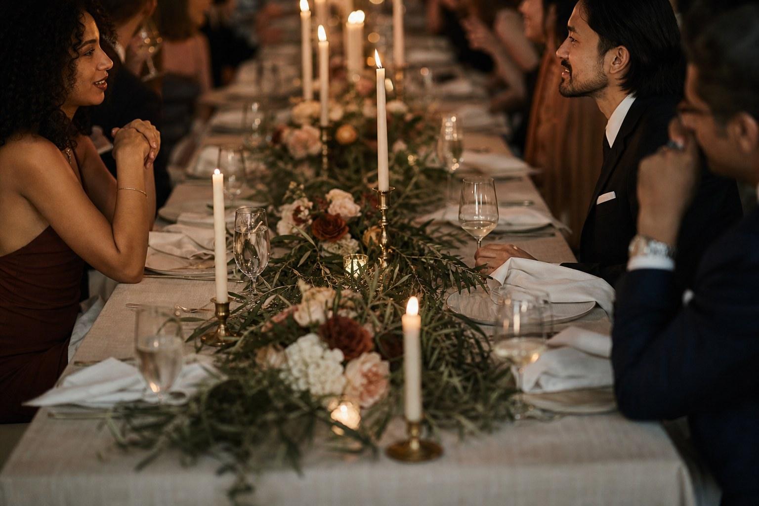
A neutral (ivory, oatmeal, stone, warm white) gives the eye a place to rest. A dark note (charcoal, deep green, aubergine, black candles) creates contrast so photographs have structure. Palettes made entirely of mid-tones photograph as a beige blur.
Test the palette in real materials
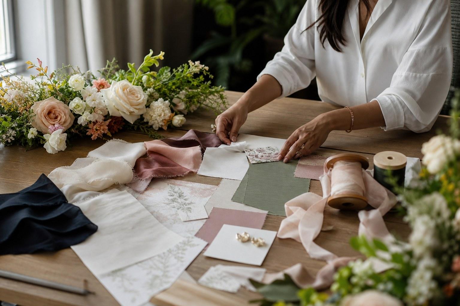
Screen colour lies. A terracotta on Pinterest can arrive as fluorescent salmon in a stretch-poly napkin. Before anything is signed off, build a physical swatch set.
If you want to understand how flowers behave inside a palette — what actually exists in each colour and season — that’s the territory of our Certificate in Floral Design.
Seasonal wedding colour palettes that hold up
Season matters less for the palette itself and more for what’s available and how light behaves. A few directions that consistently photograph well:
| Season | Palette direction | Why it works |
|---|---|---|
| Spring | Soft white, butter, pale lilac, fresh green | Bright natural light supports pale tones without washing them out |
| Summer | Ivory, stone, olive, one saturated accent | Harsh midday light flattens colour, so contrast has to be built in |
| Autumn | Rust, caramel, cream, deep burgundy | Golden hour amplifies warm tones beautifully |
| Winter | Charcoal, deep green, ivory, brass or candlelight | Low light means depth and glow matter more than colour |
Note what those have in common: a neutral, a dominant, a depth, and a single accent. That structure is far more important than the specific colours.
How to present a palette to a couple
Do not send a grid of nine colour squares. Colour squares invite line-by-line debate about whether swatch four is too pink. Present the palette as a scene instead.
And put the palette in the styling proposal in writing, so nobody arrives on the day with a surprise sash colour a well-meaning aunt found on sale.
Wedding colour palette mistakes to avoid
Want to build the whole skill set — styling, planning and the business behind it? The Advanced Certificate in Wedding Planning, Styling and Business covers all three.
Frequently asked questions
How many colours should a wedding palette have?
Three to four, including a neutral. Beyond that you lose cohesion. Add depth by using lighter and darker tones of the colours you already have rather than introducing new ones.
Should the wedding colour palette match the season?
It should respect the season’s light and flower availability, but it doesn’t have to be literal. A pale winter wedding works beautifully if you add candlelight and a dark contrast note.
How do I choose a palette for an ugly venue?
Work with the venue’s fixed colours rather than against them, and use scale — large-format drapery, generous greenery, low candlelight — to redirect the eye. Fighting a burgundy carpet with pastels never ends well.
Do the bridesmaid dresses have to match the palette exactly?
They should sit within it. Tonal bridesmaid dresses — several shades of the same hue — are far more forgiving than an exact match and photograph with more depth.
Do I need a styling qualification to offer this?
There’s no legal requirement, but colour theory, proportion, materials and proposal presentation are learnable skills, and training gets you there far faster than trial and error on paying clients.
Your next step
A good palette is not the prettiest set of colours. It’s the set that survives the venue, the light, the budget and the camera — and still looks like the couple. That’s a design skill, and it’s teachable.
Our Certificate in Wedding Styling takes you through colour, proportion, materials and how to present a concept clients approve without twelve rounds of revisions.